Visualizing data using the plot_slice function
plot_slice is a function that is capable of plotting 2-D datasets on axes which need not be orthogonal. This was designed originally for plotting X-ray scattering datasets much in the way that the NeXpy package does.
Importing plot_slice
from nxs_analysis_tools import plot_slice, load_transform, load_data
from nxs_analysis_tools.datasets import cubic, hexagonal, vacanciesfft
from nexusformat.nexus import NXdata, NXfield
import numpy as np

# Load example datasets and obtain their cache directories
sample_dir_cubic = cubic(temperatures=[300])
sample_dir_hexagonal = hexagonal(temperatures=[300])
data_path_fft = vacanciesfft()
Downloading file 'hexagonal_300.nxs' from 'https://raw.githubusercontent.com/stevenjgomez/dataset-hexagonal/main/data/hexagonal_300.nxs' to '/home/docs/.cache/nxs_analysis_tools/hexagonal'.
Downloading file '300/transform.nxs' from 'https://raw.githubusercontent.com/stevenjgomez/dataset-hexagonal/main/data/300/transform.nxs' to '/home/docs/.cache/nxs_analysis_tools/hexagonal'.
Downloading file 'fft.nxs' from 'https://raw.githubusercontent.com/stevenjgomez/dataset-vacancies/main/fft.nxs' to '/home/docs/.cache/nxs_analysis_tools/vacancies'.
Import data
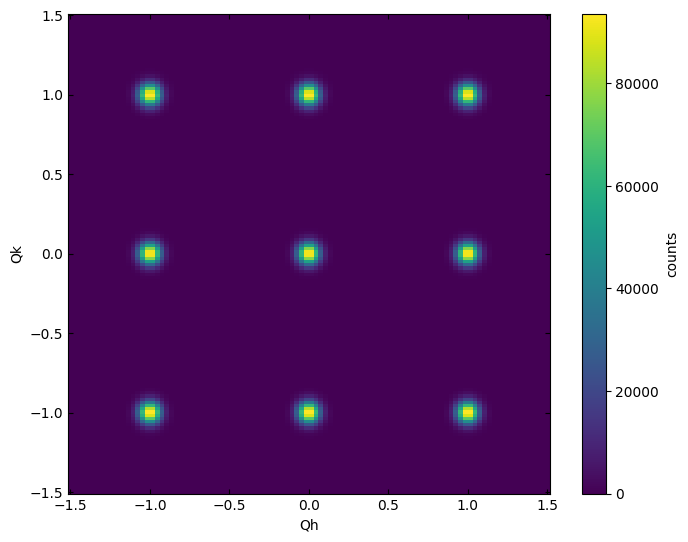
data_cubic = load_transform(sample_dir_cubic + '/cubic_300.nxs')
data_hex = load_transform(sample_dir_hexagonal + '/hexagonal_300.nxs')
data:NXdata
  @axes = ['Qh', 'Qk', 'Ql']
  @signal = 'counts'
  Qh = float64(100)
  Qk = float64(150)
  Ql = float64(200)
  counts = float64(100x150x200)
data:NXdata
  @axes = ['Qh', 'Qk', 'Ql']
  @signal = 'counts'
  Qh = float64(100)
  Qk = float64(150)
  Ql = float64(200)
  counts = float64(100x150x200)
Basic plotting
Plot slice accepts an NXdata object which holds 2-D data. Thus, if working with a 3D scattering dataset, you must index one of the axes or provide the optional sum_axis parameter which allows for integration along one of the axes before plotting.
Here we plot the L=0 plane.
plot_slice(data_cubic[:,:,0.0])
<matplotlib.collections.QuadMesh at 0x7fac7b4b8fd0>
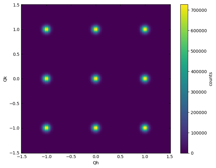
In the case that we want to integrate a small width out of this plane, we can use sum_axis=2 (0=H, 1=K, 2=L) and provide a 3D dataset which has a small width along the L direction.
plot_slice(data_cubic[:,:,-0.1:0.1], sum_axis=2)
<matplotlib.collections.QuadMesh at 0x7facb80fe860>
Transposing the X and Y axes
plot_slice(data_cubic[:,:,0.0], transpose=True)
<matplotlib.collections.QuadMesh at 0x7fac7b4b8700>

Plotting on non-orthogonal axes
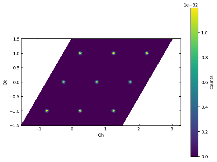
When working in a non-orthorhombic cell, it may be necessary to specify the skew angle between the axes of interest. Here, we consider a hexagonal crystal structure, for which H and K are 60$^\circ$ apart.
If we plot the data using no additional arugments, we see that the Bragg reflections are skewed.
plot_slice(data_hex[:,:,0])
<matplotlib.collections.QuadMesh at 0x7fac76206410>
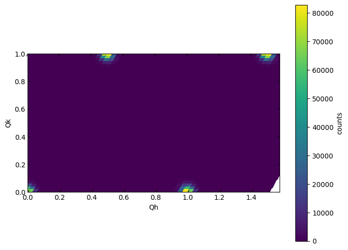
Use the skew_angle parameter to correct the angle between the plotted X and Y axes.
plot_slice(data_hex[:,:,0], skew_angle=60)
<matplotlib.collections.QuadMesh at 0x7fac762decb0>
Adjusting axis limits
Note that the x-axis limits are interpreted in a way that displays the full area covered by the specified x and y limits. Thus, when working with a skewed dataset, the actual tick marks on the x-axis will extend longer than the specified limits.
plot_slice(data_hex[:,:,0.0], skew_angle=60, xlim=(0,1), ylim=(0,1))
<matplotlib.collections.QuadMesh at 0x7fac762ab4f0>
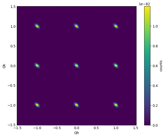
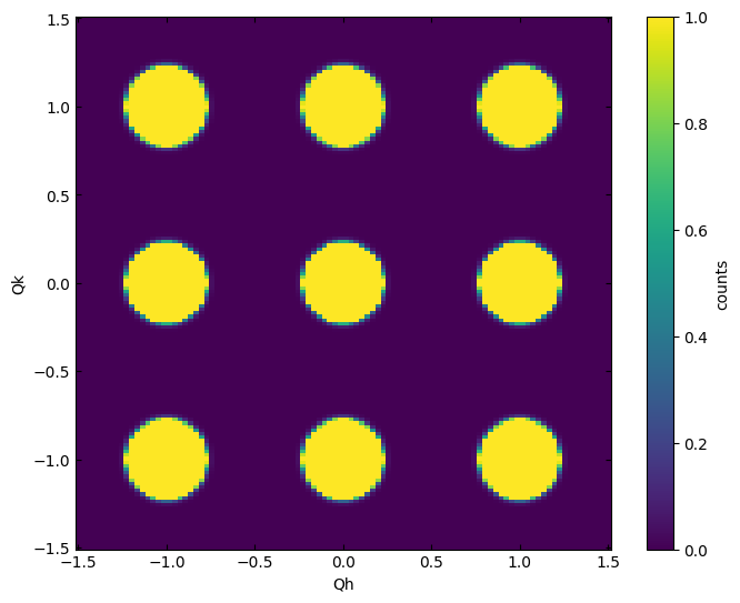
Adjusting color mapping
plot_slice(data_cubic[:,:,0.0], vmin=0,vmax=1)
<matplotlib.collections.QuadMesh at 0x7fac762ab550>
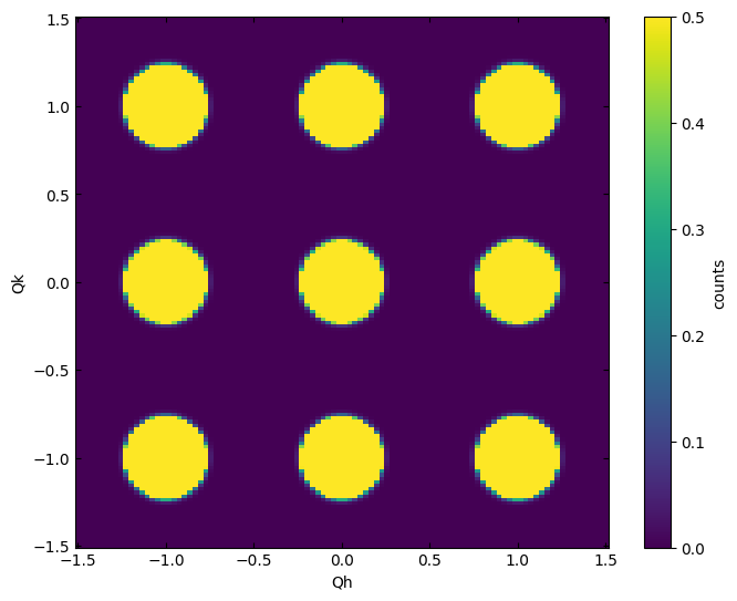
plot_slice(data_cubic[:,:,0.0], vmin=0,vmax=0.5)
<matplotlib.collections.QuadMesh at 0x7fac75f86a10>
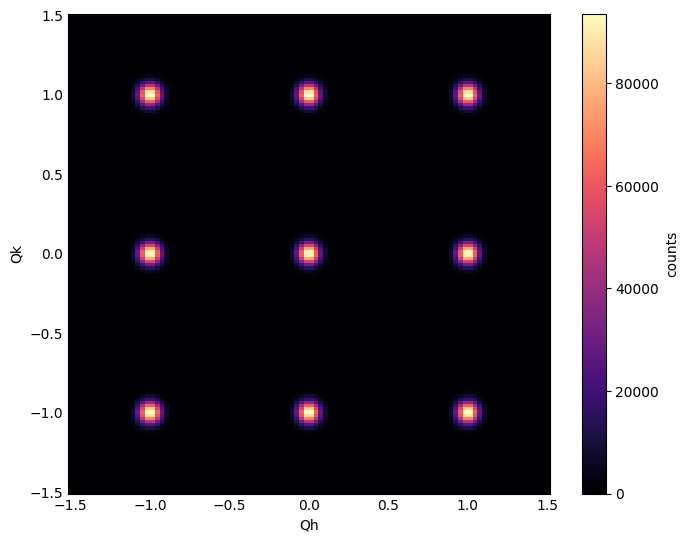
plot_slice(data_cubic[:,:,0.0], cmap='magma')
<matplotlib.collections.QuadMesh at 0x7fac7634a410>
Using logscale
plot_slice(data_cubic[:,:,0.0], logscale=False)
<matplotlib.collections.QuadMesh at 0x7fac75ef5030>
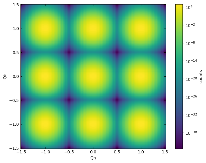
plot_slice(data_cubic[:,:,0.0], logscale=True)
<matplotlib.collections.QuadMesh at 0x7fac76076f20>
Using symlogscale
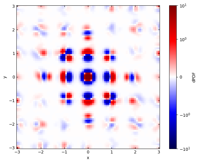
First, let’s load an example dataset with both positive and negative values
fft = load_data(data_path_fft)
data:NXdata
  @axes = ['x', 'y', 'z']
  @signal = 'dPDF'
  dPDF = float64(85x85x85)
  title = 'data/data'
  x = float64(85)
  y = float64(85)
  z = float64(85)
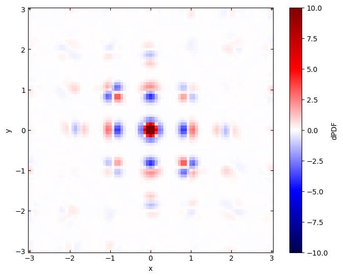
Without the symlogscale, the data is plotted on a linear colormap. Both a vmin and vmax can be provided for the limits of the colormap.
plot_slice(fft[:,:,0.0], cmap='seismic', symlogscale=False, vmin=-10, vmax=10)
<matplotlib.collections.QuadMesh at 0x7fac75af5810>
With symlogscale enabled, only the vmax parameter is used the colorbar is symmetric about zero.
plot_slice(fft[:,:,0.0], cmap='seismic', symlogscale=True, vmax=10)
<matplotlib.collections.QuadMesh at 0x7fac759872b0>